Volunteer Project · 2024
Mutual Aid NYC's Resources section hadn't been meaningfully updated since the start of the COVID-19 pandemic. Content was outdated and misaligned with current needs, and resources weren't organized, navigable, or usable across devices, languages, neighborhoods, and disabilities.
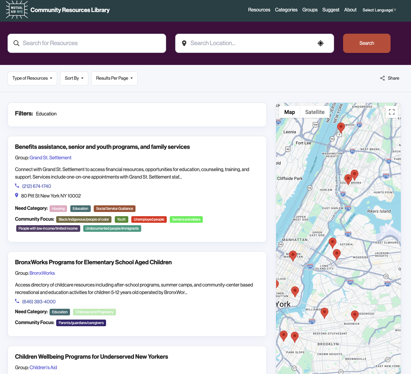
I redesigned the Resources section to make clear what help exists and how to access it, framing "users" as neighbors with real, often urgent needs, not abstract search queries. The structure was built to hold up as the resources scale.
In this case study, I walk through how I diagnosed three barriers to finding and trusting help and the research, content, and interaction design decisions that addressed each.

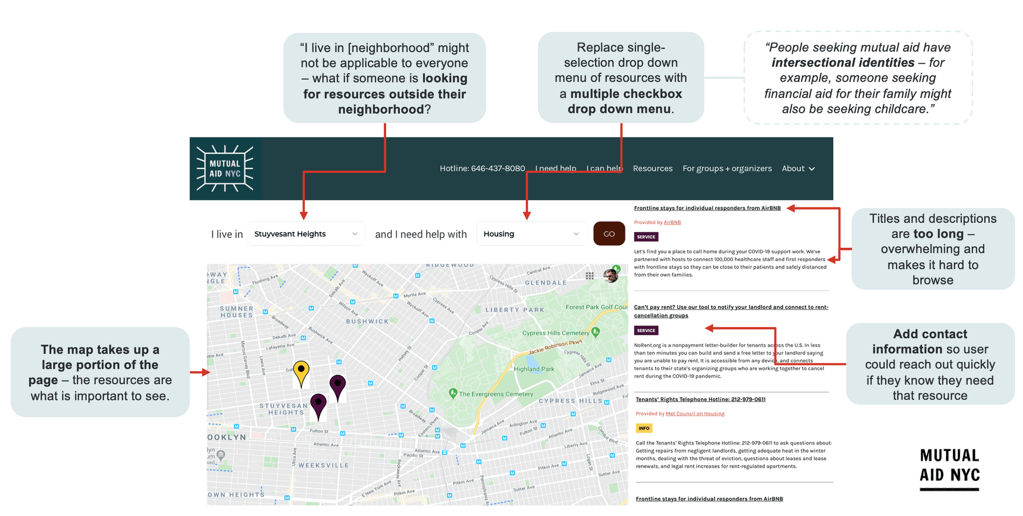
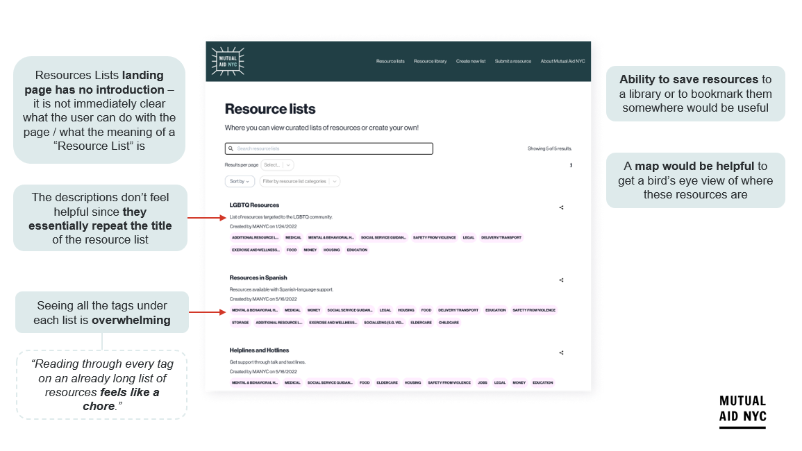
The resources page relied on broad tags that offered little room to filter by specific need or audience, leaving users to sift through an undifferentiated list regardless of their actual circumstances or intersecting identities.
The resource descriptions were lengthy and overwhelming to process, with little context or visual cues to quickly gauge what the resources are or how to use them.
Users frequently did not know who to contact or are otherwise not confident they are contacting the right person.

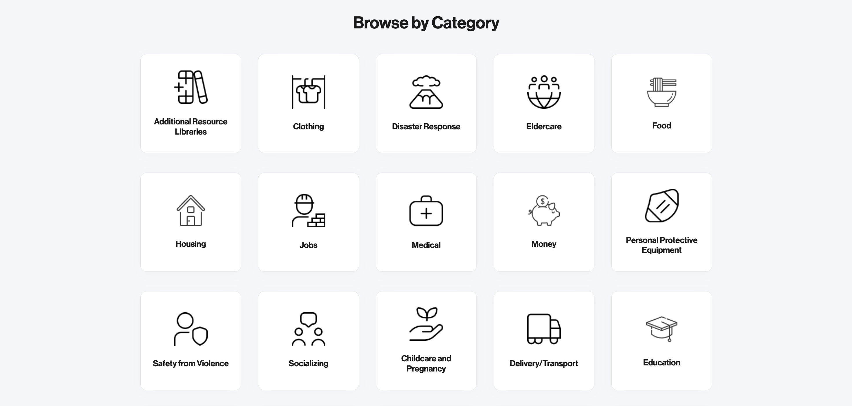
Mutual aid resources exist to meet a wide range of needs, often for people navigating more than one circumstance at once. But the resources page presented every listing through a limited set of generic tags. The redesign needed to allow for crisis-specific journeys with clear resource types and audiences, rather than treating every need and every user as interchangeable.
Methods
Opportunities

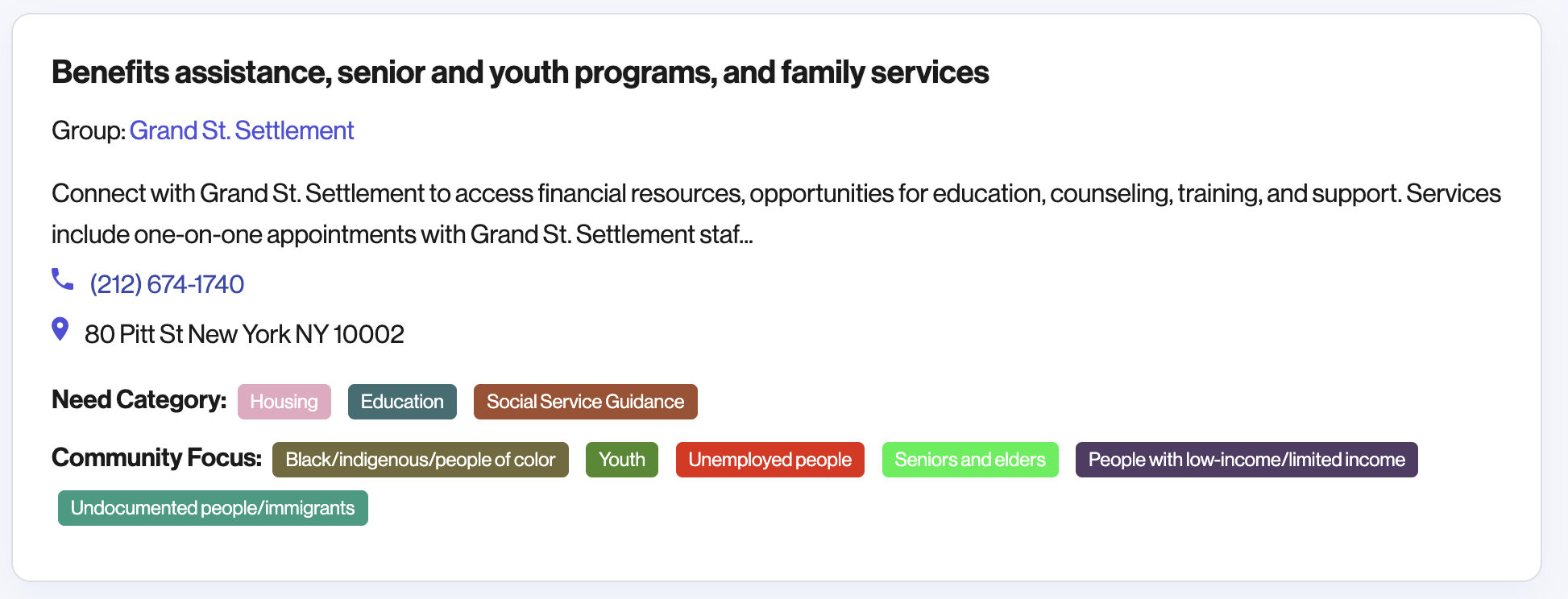
Mutual aid resource pages often need to communicate a lot of key information at once (e.g., what a resource offers, who it's for, how to access it), but that information doesn't need to come at the cost of clarity. Resource descriptions were text-heavy with no visual cues or content structure to help users quickly gauge what a resource was or whether it applied to them. When someone is scanning and comparing multiple resources, often under time pressure, a wall of dense text works against users taking action.
Methods
Opportunities

Usability testing
Resources were inconsistent in how to engage with them. If they didn't have a number, the address wasn't available. Had to click into the resources to see these.
Methods
Opportunities

Every participant preferred the new filtering system over the original, even as the number of resources scaled past 150.
Clearer contact information and organization identity on each resource tile cut the average time for users to confidently identify who to contact from 29 seconds to 16 seconds.
Most participants said they felt "organized" and "less overwhelming" navigating the redesigned page, and that they'd turn to it if they or a friend needed to find mutual aid resources.