General Assembly UX Design Certification Project · 2023

Deadwax

Background

We’re in the midst of a “vinyl renaissance” – that is, a renewed interest in owning vinyl records. Despite this uptick in consumption, buying records online is still confusing to understand and difficult to navigate for beginners and collectors alike. With so many different places to shop and variations of an album to choose, the buyer spends a lot of time searching with little confidence that they'll get what they're looking for.

Solution

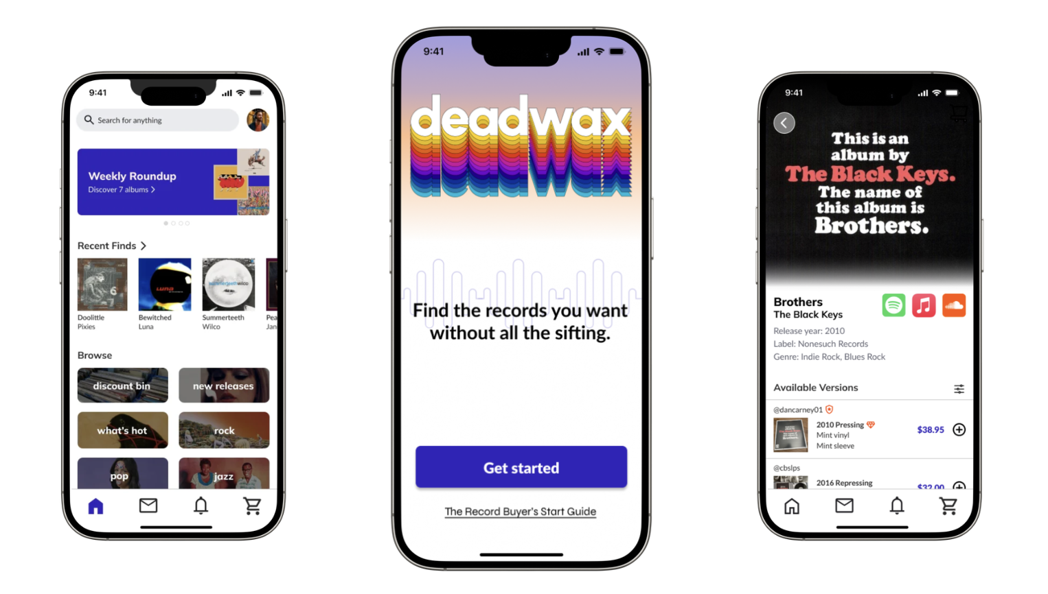
Deadwax is an online marketplace solely for buying vinyl records from verified sellers and record stores. Designed from the buyer's perspective, it prioritizes the availability of accurate, clear, and transparent information when shopping for vinyl records.

In this case study, I demonstrate how I designed the record search process with progressive disclosure patterns and concise, jargon-free copy, matching the right detail to buyers needs at each stage.
Problems

As defined by interviews and moderated usability testing of competitor sites with 22 users (both hobbyists and avid collectors).

1.

Online vinyl listings overwhelm buyers with jargon-heavy, inconsistent descriptions.

2.

Users spend extra time searching for the information they need and second-guess their choices, leading to low confidence in purchase decisions.

3.

Competitor analyses (Discogs, Ebay, Etsy) show missed opportunities to surface the right details at the right time in the buyer journey due to too much information shown at once.

Approach

Other marketplaces, like Discogs, use the Goldmine Standard to mark the condition of the vinyl and sleeve. This is a granular scale with 9 tiers, built for collectors who grade records professionally. Thus, the gap between "Very Good Plus" and "Good Plus" is meaningless to most buyers, but it's still the primary signal they buy on.

Methods

  • Competitive analysis of existing marketplaces (Discogs, Ebay, Etsy) to identify established conventions and inform the initial scale structure
  • Synthesis of language surfaced from user interviews, cross-referenced against competitive analysis findings, to define scale tier names that felt both familiar and distinct
  • Consistency testing with 12 participants independently grading the same records to confirm the scale's boundaries are consistently interpreted

Opportunities

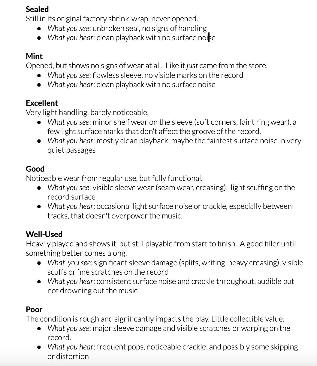
  • Simplified grading scale with six plain-language tiers (Sealed, Mint, Excellent, Good, Well-Used, Poor), each defined by what the buyer will actually see and hear (vs collector jargon)

Across competitor sites, trust signals (e.g., seller ratings, condition, shipping information) were buried in a sea of extraneous information. Usability testing showed that this ambiguity was the biggest driver of hesitation and abandoned carts.

Methods

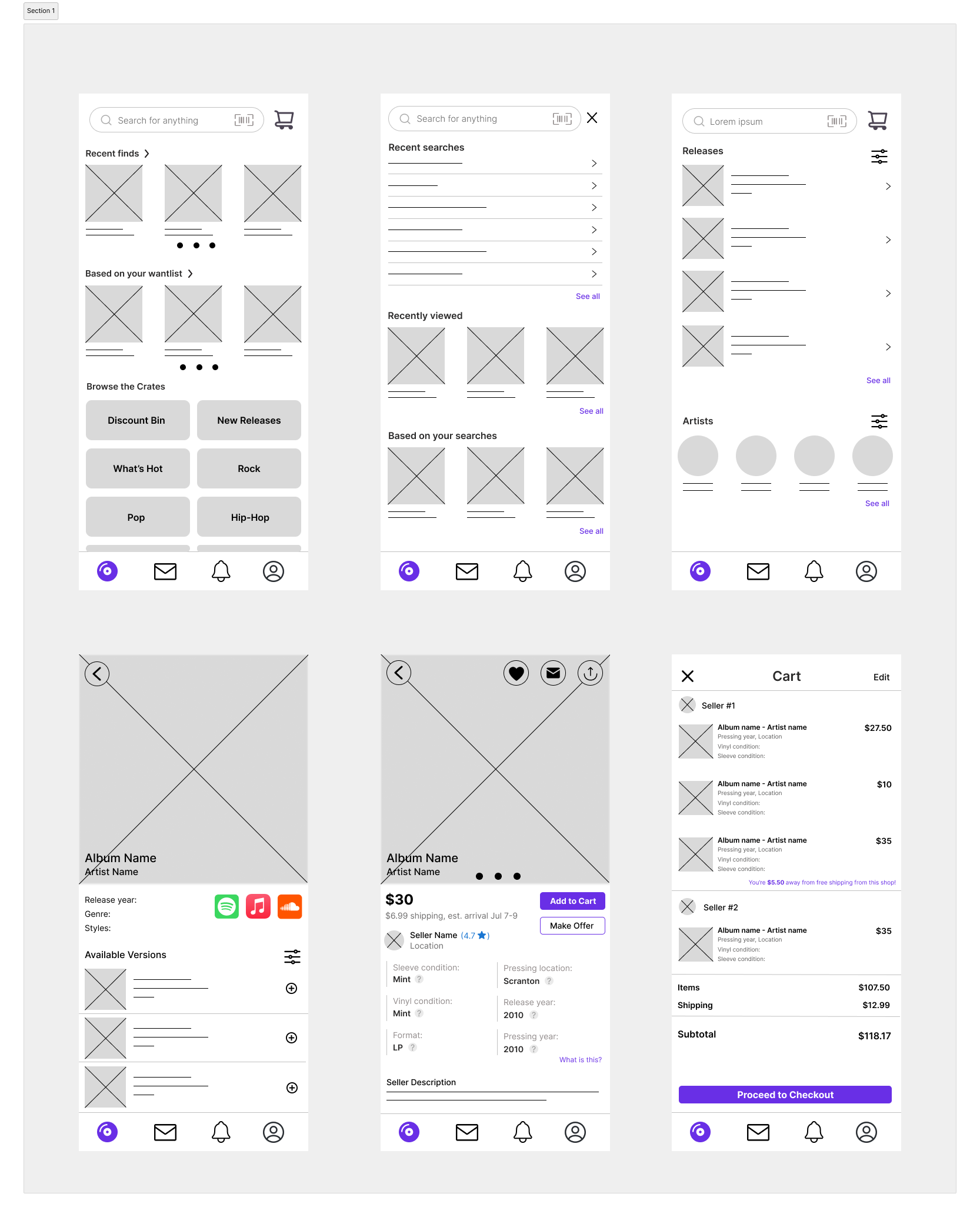
  • Hi-fi wireframing of layout variants that reprioritize trust signals (based on persona development)
  • Preference testing across variants to understand which one(s) reduce the ambiguity driving hesitation and cart abandonment

Opportunities

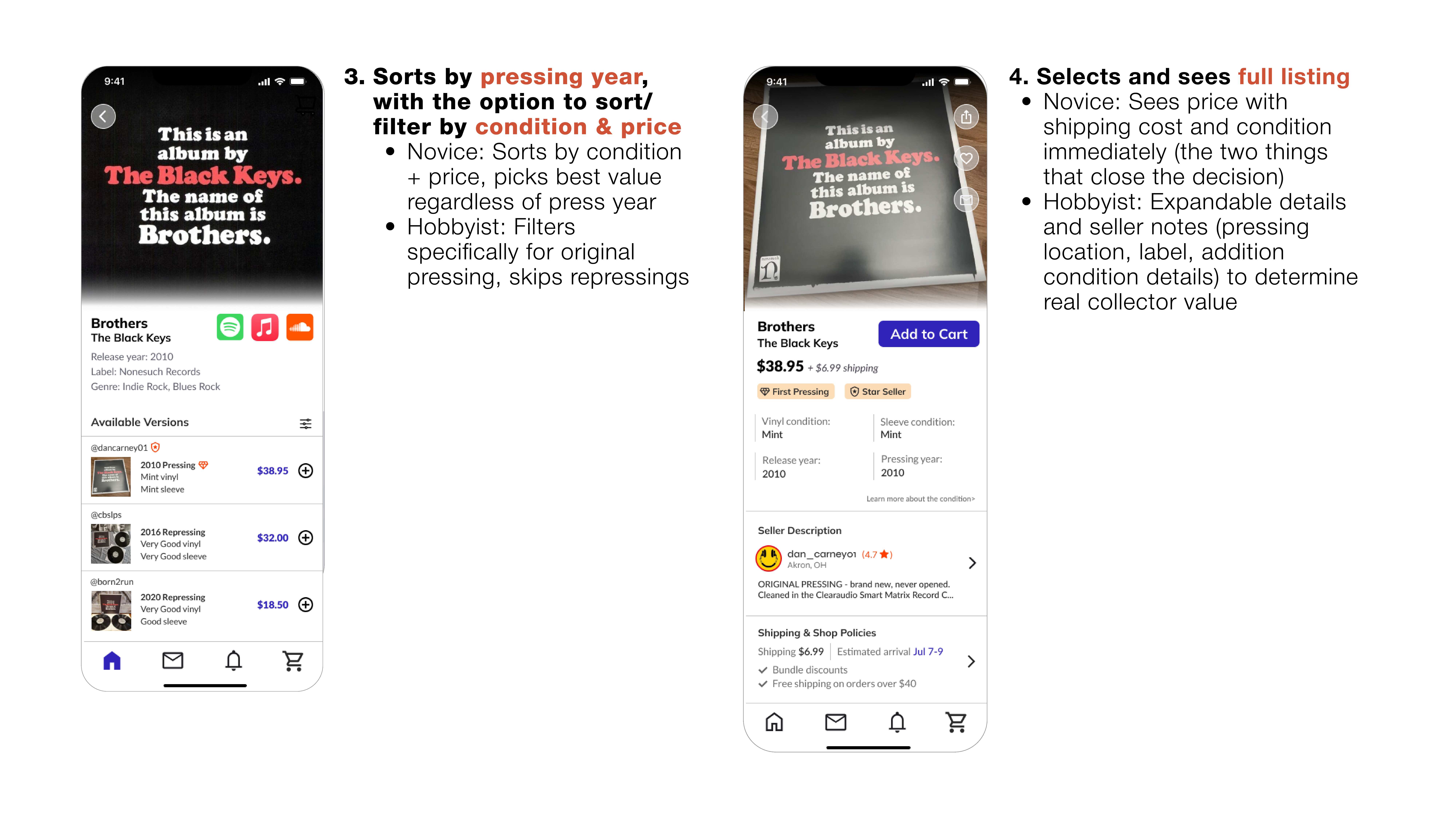
  • Condition is communicated upfront with the six-tier grading system, with a hover/tap tooltip on each grade defining its condition in standardized, plain language (surface noise, sleeve wear, etc.), so buyers don't have to decode ambiguous or inconsistent grading language before deciding whether to trust the listing
  • Seller trustworthiness is signaled immediately via a clear rating and "Star Seller" badge for high sales volume and a consistently low rate of condition disputes, not only pointing users to trustworthy sellers but incentivizing ethical selling
  • Full cost with estimated arrival is transparent before checkout, alongside a visible return/dispute policy

Most buyers search for a specific album rather than browse, so the IA should serve a targeted search-to-purchase journey, not a browsing one. Competitor sites do not support this workflow, as both casual and expert buyers are given the exact same wall of information without a path that adapts to what they're actually trying to decide.

Methods

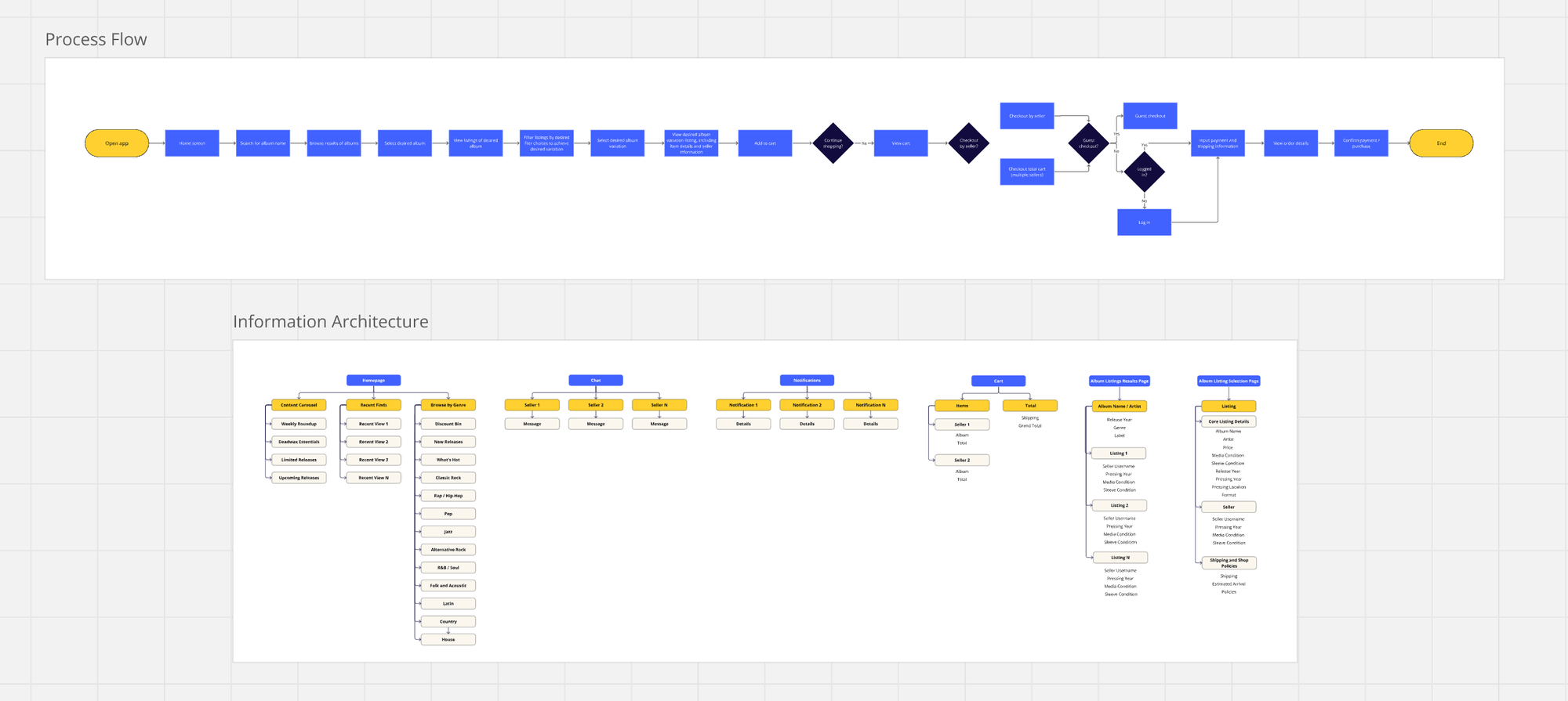
  • Persona and journey mapping to identify both casual and expert buyers' needs across the search-to-purchase journey. Incorporated a content taxonomy to define how users describe a record at each stage of the journey, informing how search and filtering should be labeled.
  • Task analysis to identify exactly where casual and expert buyers' paths diverge rather than serving both the same undifferentiated flow
  • Scenario-based usability testing on the prototype to confirm both buyer types could navigate directly to what they needed

Opportunities

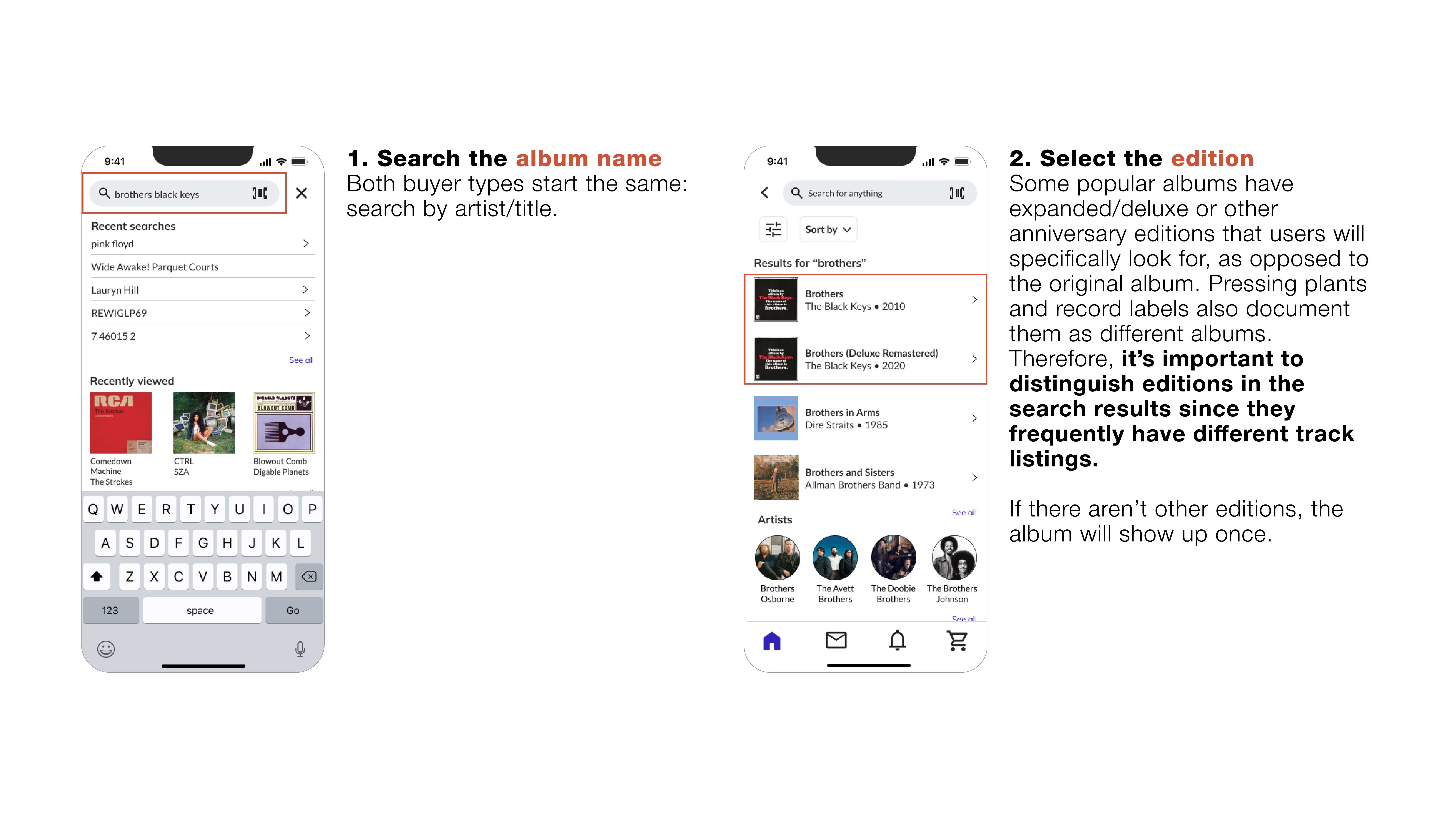
  • Search results surface only name/artist, condition, price, and rating (the attributes buyers weighted most heavily), letting buyers scan and compare at a glance
  • Opening a listing reveals full detail progressively (e.g., grading specifics, shipping details, seller notes) rather than front-loading everything, enabling expert buyers to dig deeper if desired
Miro board of task process flow and information architecture based on task analysis and content taxonomy

Outcomes

After interviewing 12 users from my initial research

Faster decision-making

Users believed they would find the record they wanted more quickly.

Lower cognitive load, especially for novices

The simplified five-tier grading system let casual buyers act on condition information immediately, without needing to learn collector terminology first.

Increased purchase confidence

Users reported feeling more certain they'd selected the correct edition and pressing, no longer second-guessing themselves between similar-looking listings

Final Search Experience